Album Design Steps
- Fill Out Album Order Form – Please fill out the form by clicking here.
- Initial Design – You will have the chance to select your favorites from a designated online gallery. Once the images are selected, we will design the first draft of your album and send you a link where you can review it.
- Major Revision – When you receive your draft, please review it in detail with the understanding that this is our creative interpretation of the story of your wedding day. You are free to make image and layout changes in your first revision (of two). To communicate your changes, you will make comments directly on the online proof, page by page. For example, if you would like to replace an image, you can leave a comment directly on that photo saying “Replace with 0047.”
- Minor Revision – After the initial changes are submitted online, we will redesign the album and send you a second draft. You are then free to make minor changes (substitutions in images and finalizing the cover design); however, any layout changes or changes beyond the second revision will result in additional fees.
- Send to Print – After your second round of revisions are made and you have approved the design, the album is sent to retouching and then to print.
If you have any questions during this process, please email [email protected].
Album Design Philosophy
An immense amount of time, care and detail go into the album design. The goal of the album design process is to combine our creative vision of your wedding day with your ideas in a collaborative effort to create a beautiful heirloom.
What Is our Album Style?
When designing your album our goal is to make this special heirloom timeless and elegant with clean designs.
Things We Avoid:
- Mixing Post Production Styles – Mixing post production styles almost always creates an eyesore. For example, having a vintage fade next to a black and white next to a vibrant colored image is simply too distracting. We design our albums to incorporate one post production style per spread.
- Mixing Too Many Colors – We try our best to keep the colors consistent. For example, if the scene is an outdoor ceremony with lots of greens and natural light, we want to make sure each image on that spread fits the scene and the colors within that scene.
- Mixing Moments – We want each spread to tell the story of one moment (or one series of moments). A ceremony page should be devoted to the ceremony, a bridal prep spread should be exclusively bridal prep pictures, etc.
- Cramming Too Many Images in a Page – One of our most important points of emphasis is not cramming too many images on one spread. It may be tempting to “get the most” out of each spread by putting in dozens of images on each spread, but in the end, this typically leads to limited design options and a strong cluttered feeling. Imagine a home with too much furniture or a phone with too many buttons. Sometimes less is more, and this is particularly true with album design.
- Using Image Overlays – Overlaying images is an older, dated design feature in which the designer lowers the opacity (i.e. the transparency of an image) and overlays other images on top of that image. We feel this style dates the album spread and also clutters it up.
- Using Floral Graphics, “Designer” Borders, and Backgrounds Other Than Black and White – Bringing in vector graphics (floral embellishments, etc.) is something we avoid to ensure an album is timeless and image-centric. Using borders and background colors other than black and white is most often distracting.
Album Examples:
The following examples are from a 12×12 Flush Mount album. The center fold in the middle of each spread divides it into two pages. Before you begin the album design process, it is important for you to understand our vision for telling your story. Here are a few sample spreads to help illustrate our album design philosophy.
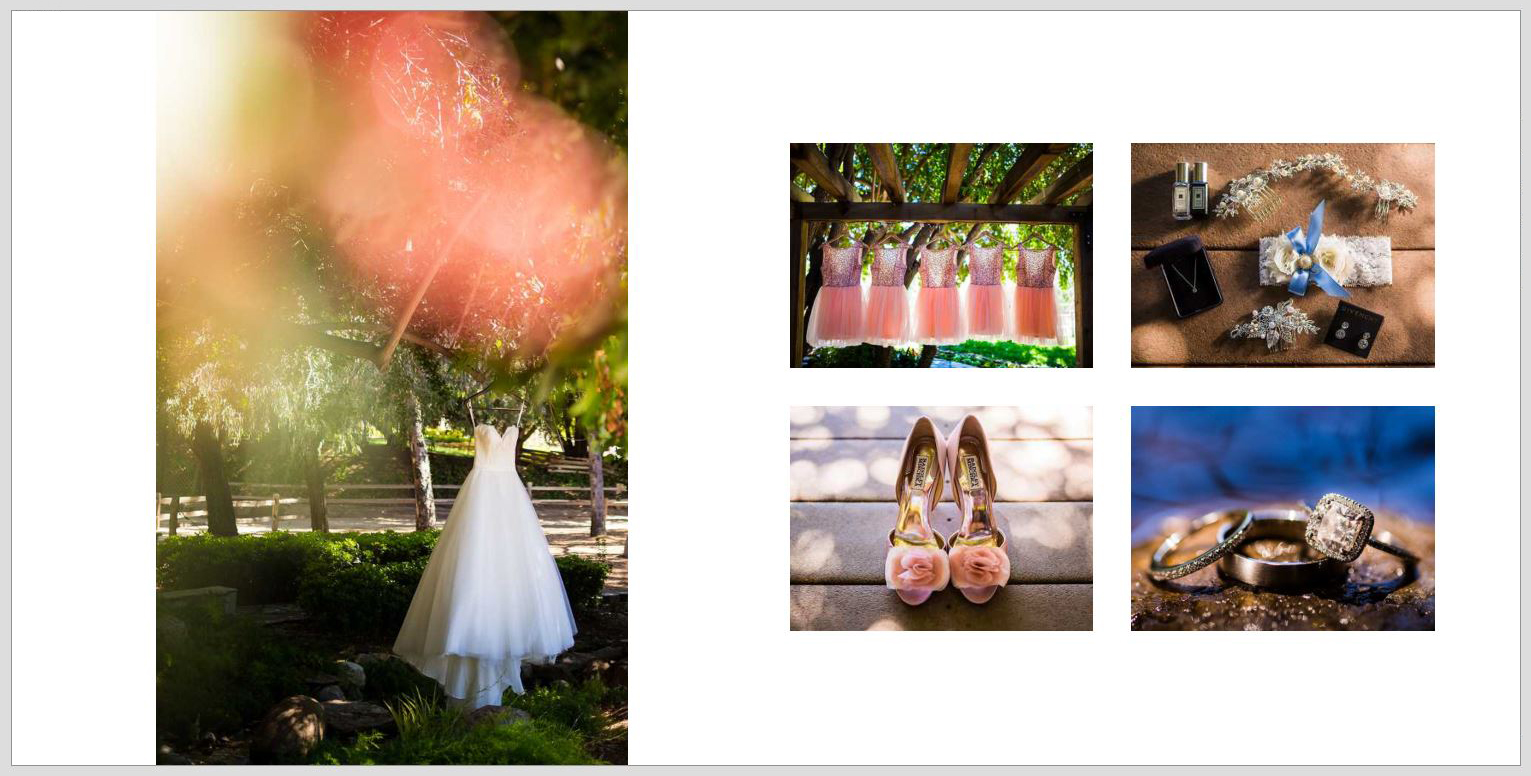
Sample Spread 1 – Details
This is the first spread in an album and it is intended to set the scene. Notice that the dress is the primary focus, with the rest of the collage supporting/supplementing it.
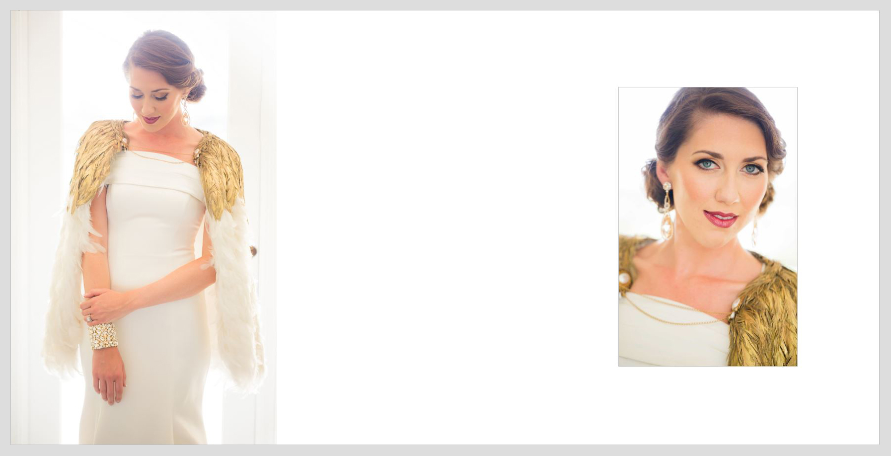
Sample Spread 2 & 3 – Portraits
The images chosen for these spreads all share the same background making the spread look concise, clean and elegant. A thin grey border is added to images that are brighter/lighter along the edges to prevent them from blending into the white page.

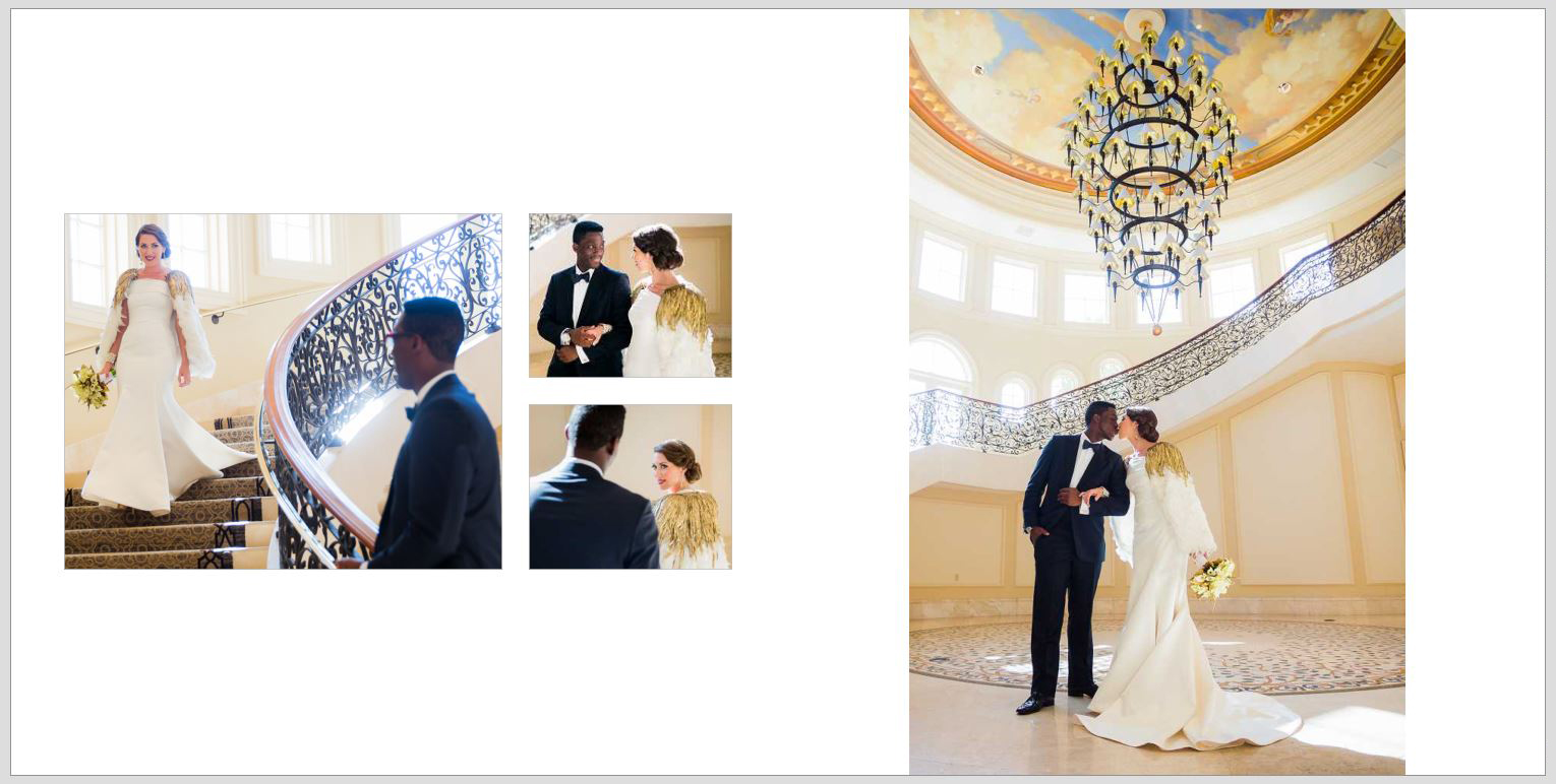
Sample Spread 4 – First Look
We chose to tell the story of this first look in 4 images, focusing on the emotions that lead to the final grand moment.
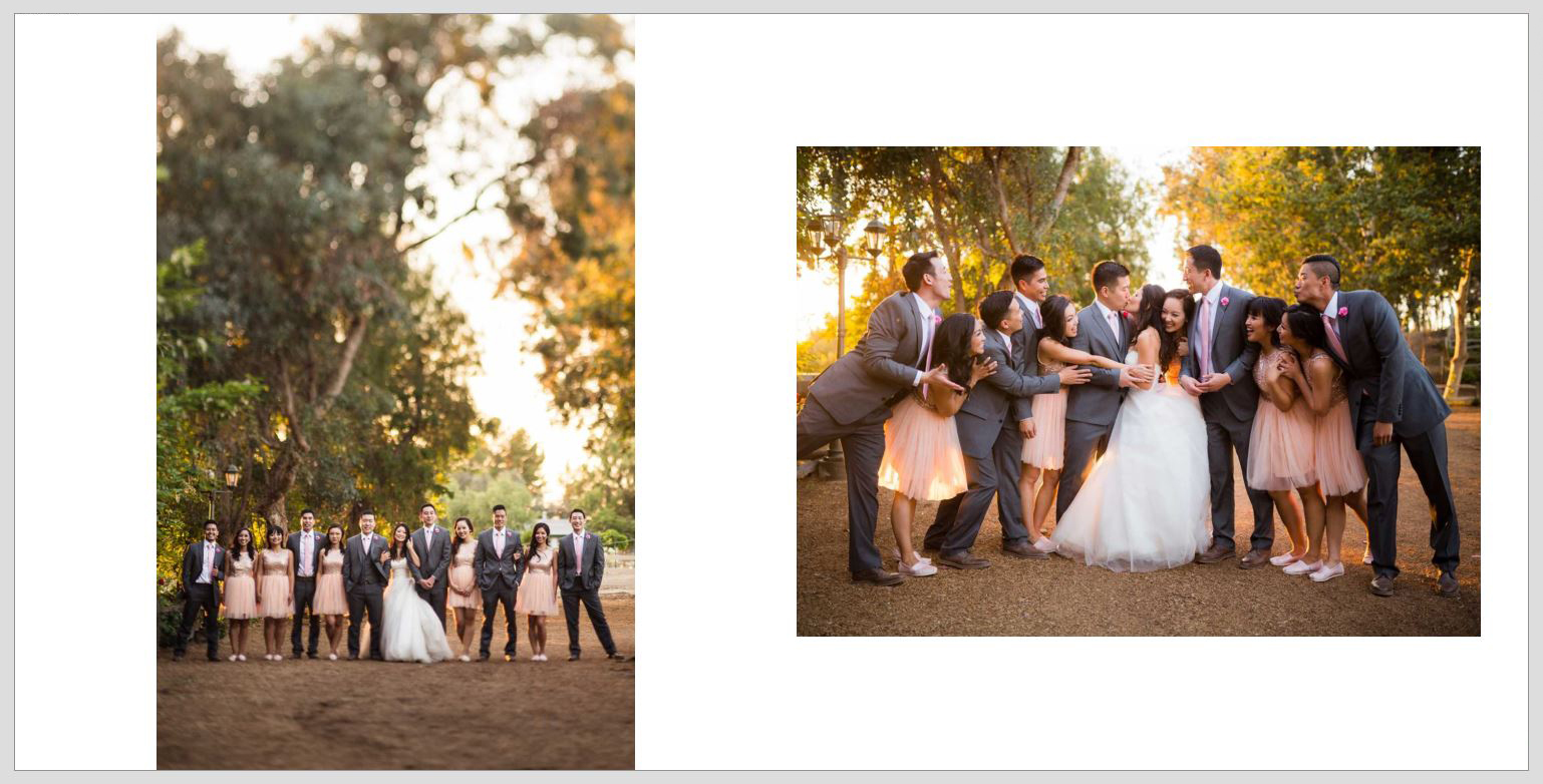
Sample Spread 5 – Bridal Party
In the following spread, we focused solely on the Wedding Party showcasing not only the beauty of their venue but the relationships and emotions of the day.
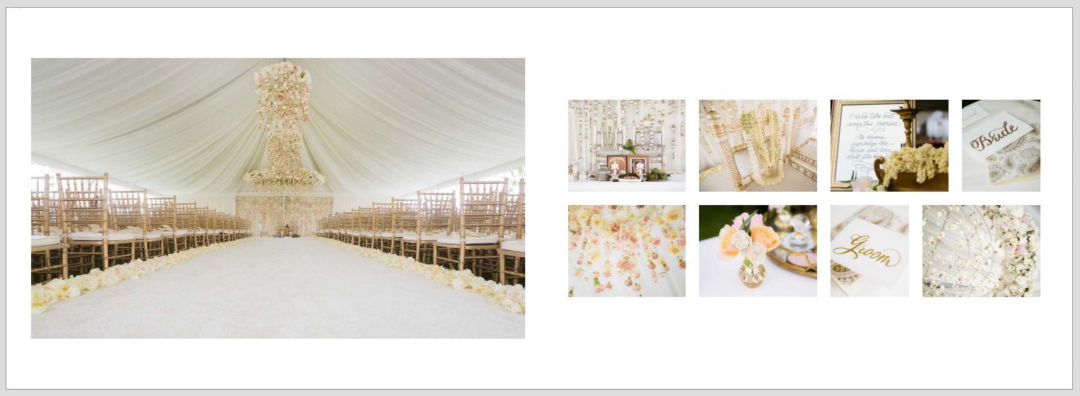
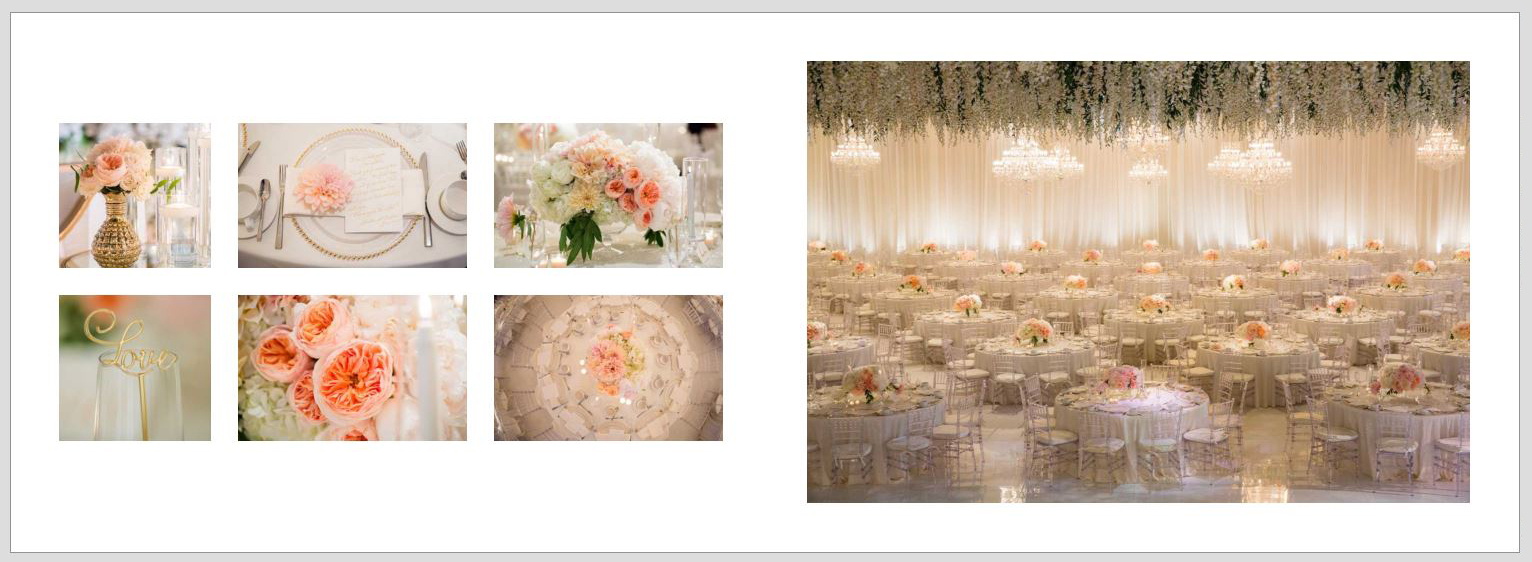
Sample Spread 6 & 7 – Details
When designing the details and ballroom spreads, we focus on the small details that work together to become the grand ceremony or reception hall.